Design
Peter Bil'ak's Q type system is jovial, fluid, and beautiful
It's less about legibility, the designer says, and more about unleashing your inner creativity.
Sometimes typefaces can be serious. Other times fonts can be brought back from the dead. But when it comes to Peter Bil'ak's typography, fluidity is at the heart of his design. When you look at Bil'ak's Q type system, you'll notice that the rules are bent, formality is refreshingly cast aside, and all movement is impromptu. He's especially clear about the entire design in his Importance of Play explanation for the Q font system.
When it comes to words like "playful" and "experimental," Bil'ak worries that the world may see those two terms as antithetical to the more serious-sounding "useful" or "functional." But these apprehensions didn't stop the Netherlands-based artist from experimenting with the font and creating a kit out of it.
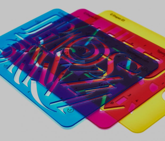
Generally, fonts are presented in full with each letter, number, and symbol laid out in various weights. But Bil'ak's font is more of a set of variables that lends itself to a seemingly infinite number of applications.

What makes Q special? — Q's beauty is in its mathematical roots. The system contains six uppercase base fonts and then on top of that, it has 35 layers in the form of Q Base and Serifs. What makes Q special is how its base fonts and layers can be used in both horizontal and vertical forms. Throw in a splash of color and you have a rather gorgeous type system.
Where can I use Q? — That's entirely up to you. In comments to Eye On Design, Bil'ak explained, "Q is designed like an open-ended system that doesn’t make any assumption of the desirable outcome."
"That’s why I compared it to Lego, or other games," he added. Q is as well suited to album art, large posters, or murals, as it is to book covers or business cards.
Bil'ak's design breathes new air into the world of typography. But the most compelling aspect of the entire type system is the philosophy that underpins it. Bil'ak is big on not taking yourself too seriously. He derives inspiration from the likes of the Catalan printer and typographer Joan Trochut who once created a system of geometric and ornamental symbols. So it wasn't just letters but also borders, designs, and at times even sketches that expressed artists' messages and creativity.
Q is about enabling that kind of open-ended type system. Bil'ak wrote that using the type will require a tiny bit of patience and it may even lead to unexpected discoveries. But that's what makes it so invigorating. "This is the magic of designing games, the joy of inviting people to participate in your creation, to complete it or even reinvent it," he wrote. "Q invites you to solve puzzles that may not exist yet."
