New Age
The 2021 Bronco’s sci-fi interface confirms a hybrid model is coming
The enchanting, neumorphism-laden imagery and animations in the Sync infotainment system for the new Ford Bronco proves an electrified version is in the works.
Ford's 2021 Bronco looks amazing. But forget the rugged exterior and playful boxiness, what we're really excited about is the user interface. It's a brilliant take on the emergent design discipline of neumorphism. And Apple and Google should pay attention. And it hints that what we really want — an electric, or at least hybrid, Bronco — is in the works.
One of the images includes mention of "EV Coaching" with a gauge labeled charge. That's great news for consumers itching for an electric off-roader. But worrying for companies like Rivian, that hoped to beat the big names to the punch.
Further confirmation comes from a post on Autoevolution that quotes a Ford transcript from a shareholder meeting last year where CEO Jim Hackett said, “[W]e’re adding hybrid electrics to high-volume profitable vehicles like Explorer and the new exciting Bronco.”
Critics have gone after the new Bronco for eschewing climate considerations in exchange for power and flexibility, but a hybrid version of the truck could go a long way to quieting those arguments.

While everyone else was cooing about the removable doors and roof panels on the new Bronco, we were marveling at something else. What caught our eye — aside from the built-in bottle opener in the right-hand trunk pillar — were the animations that pop up on the central 8- or 12-inch touch display or instrument cluster when the driver switches drive modes. The way the color palettes shift to ensure continuity between the drive mode and crucial information (like how much gas is left in the tank). And even the splash screen when you turn on the vehicle.
We got our first glimpse at the interface from one of Ford's own Bronco promotional videos, but we wanted to see more. The content we discovered showed there's plenty more detail on the Bronco's unique UI to ogle if, like us, you love seeing designers wrestle with the dual — and sometimes, dueling — constraints of useability and aesthetics.
A closer look
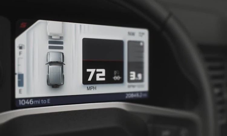
Let's start with the drive mode animations in the video below. Switch between them and you get an animation of half a globe bordered with a 2D pattern, which is trapped in a bubble-style compass, beneath a vast sky. Not only does the surface of the globe change — one minute it's opaque grass, the next, translucent water or glowing magma — but the sky above it does, too, and the lighting has to adjust accordingly. Meanwhile, 3D elements like leaves, snowflakes, or blades of grass, cross the divides between the three planes (sky, 2D belt, 3D globe) surprisingly seamlessly.
A twist of the drive mode dial switches from one environmental hemisphere, and when a user moves between them in quick succession the effect still needs to be elegant. Impressively, it is. At the same time, the colors of the digital speedometer or rev counter adjust to match the selected mode and manage to remain legible at a glance — a crucial feature of any vehicle, but especially one you might roll down a hillside if you're too distracted.
From skeuo to neu
The latest version of Sync in the Bronco embraces the neumorphic design we've previously written about Apple introducing in iOS 14. Where skeuomorphic design uses faux textures and familiar objects to help with usability, it also has the advantage of — for the most part — confining its possibilities via key limitations. There's usually a single light source that dictates shadows or other markers of depth, and 3D elements are usually limited to the digitally rendered objects, icons, or buttons, rather than extending to the planes upon which they can exist.
Neumorphism is a different beast. It maintains some of the ersatz elements of skeuomorphism but plays fast and loose with spatial constraints. It allows objects to exist in space and on multiple planes simultaneously. It has flat elements alongside three-dimensional ones. It has the possibility of infinite depth and has to contend with multiple objects that may respond to light differently, and that may be illuminated in more than one way from one menu setting to the next. That mess of potential contradictions can make it a difficult beast to tame.


It can also be a nightmare for users. It can make it hard to distinguish static elements from interactive ones. Neumorphic design can also introduce difficulties when an interface color scheme shifts from light to dark — like the differences between a car interface during broad daylight and after dark, for instance — but still needs to make it obvious whether you can tap on something or not.

Looking over the horizon
To the design team's credit, it's done a great job synthesizing the past, present, and future. Not only does the interface design look ultra-contemporary without being kitsch, it's as boisterous and playful as the new Bronco itself. It also hasn't resorted to flat or material design to communicate its modernity. That matching of playful form to adventurer function while also being intuitive is no mean feat.
Part of the reason lots of the UI works, of course, is because much of the information displayed doesn't need to adhere to placement constraints. As long as a non-interactive, information-delivering element doesn't need to be touched — and as long as you're consistent with its placement — it can exist anywhere on-screen. The distinction between what you can and can't touch needs to be more explicit on a smartphone or tablet.

Ford's out in front
Car infotainment systems have for years lagged behind the slick, leading-edge interface designs found on smartphones. Part of the problem, of course, is that people don't tend to update their cars with the annual or biannual frequency they do their phones. And until recently, over-the-air firmware updates for cars were unheard of. That meant even luxury cars were often saddled with clunky, basic, and at times vexing software, often for their entire lifespan.
For a while, it looked like many automakers were destined to forgo efforts to make good UIs themselves in favor of outsourcing key functions like navigation and media to the smartphone duopoly of Apple and Google via CarPlay and Android Auto respectively. The one notable exception has always been Ford, which was one of the first car companies to see value in putting its Sync infotainment system in even its budget vehicles and to continue to spend resources improving it.

What's wild is that we're seeing this sort of experimental interface design in a vehicle. We expect it from either of the makers of the world's most ubiquitous touch-based devices, but not a steel-bender. Granted, iOS 14 and its tentative explorations in neumorphism will arrive for consumers before the new Bronco does (and for far more of them), but Ford's full-embrace of it will live on in Broncos for many generations of iPhone to come. That's a pretty courageous move from the company that once only made its cars in one color. Now, if only it would have the courage to make the Bronco fully electric, even if only so there'd be more lightning animations.

